I don’t have a great answer for you - I tried a few different patterns myself and don’t have one I love (below is one of the first things I did after getting the laser in focus). This looks like it might work well for a consistent work material.
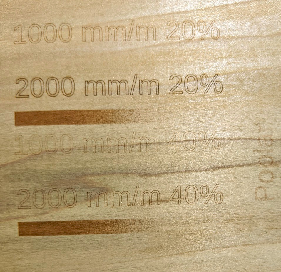
The one thing I’d suggest from my experience so far, though, is to be sure the area you’re covering with your test is large enough to show how the combination of speed/intensity performs over the variance in your material. Or in other words, if you’re using wood, be sure your test area goes over both light and dark grains, streaks, knots, or any other characteristics you’re going to encounter. The pattern you pasted above seems like it might be a little small to really see those differences if you try to do in a 130x130mm work area.
Particularly if you’re going to be using raster graphics, it’s helpful to be able to see contrast between light and dark directly adjacent to one another as they cross the grain. I made some red oak blanks for coasters over the holidays that I was going to burn with a photo. After a couple of tries, I switched to poplar because the grain was showing through too much on a raster image. I didn’t realize the contrast was going to be such an issue, because I had previously done some vector images on the same red oak material that I thought had turned out great. Oh well, lesson learned!